

Metropolis Signage & Onboarding
The goal

Create a clearer, more consistent signage system that statistically improves first-time user registration, reduces friction at entry, and strengthens the bridge between the physical and digital touch points.
My role
Design lead
Duration
9 months
Team
1 Project Manager
1 Product Designer
2 Copywriters
1 Director of Ops
Context

Metropolis averages 40-55,000 first-time users every day.
On average, 13.4% of these users don’t sign up (non-compliant) on payable parking visits.

Signage at our 4,500+ parking locations is the key entry point into onboarding and signing up.
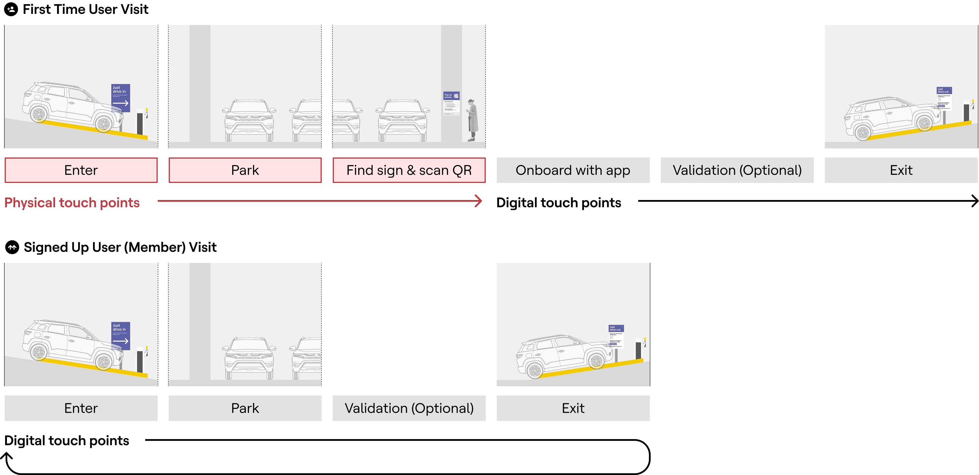
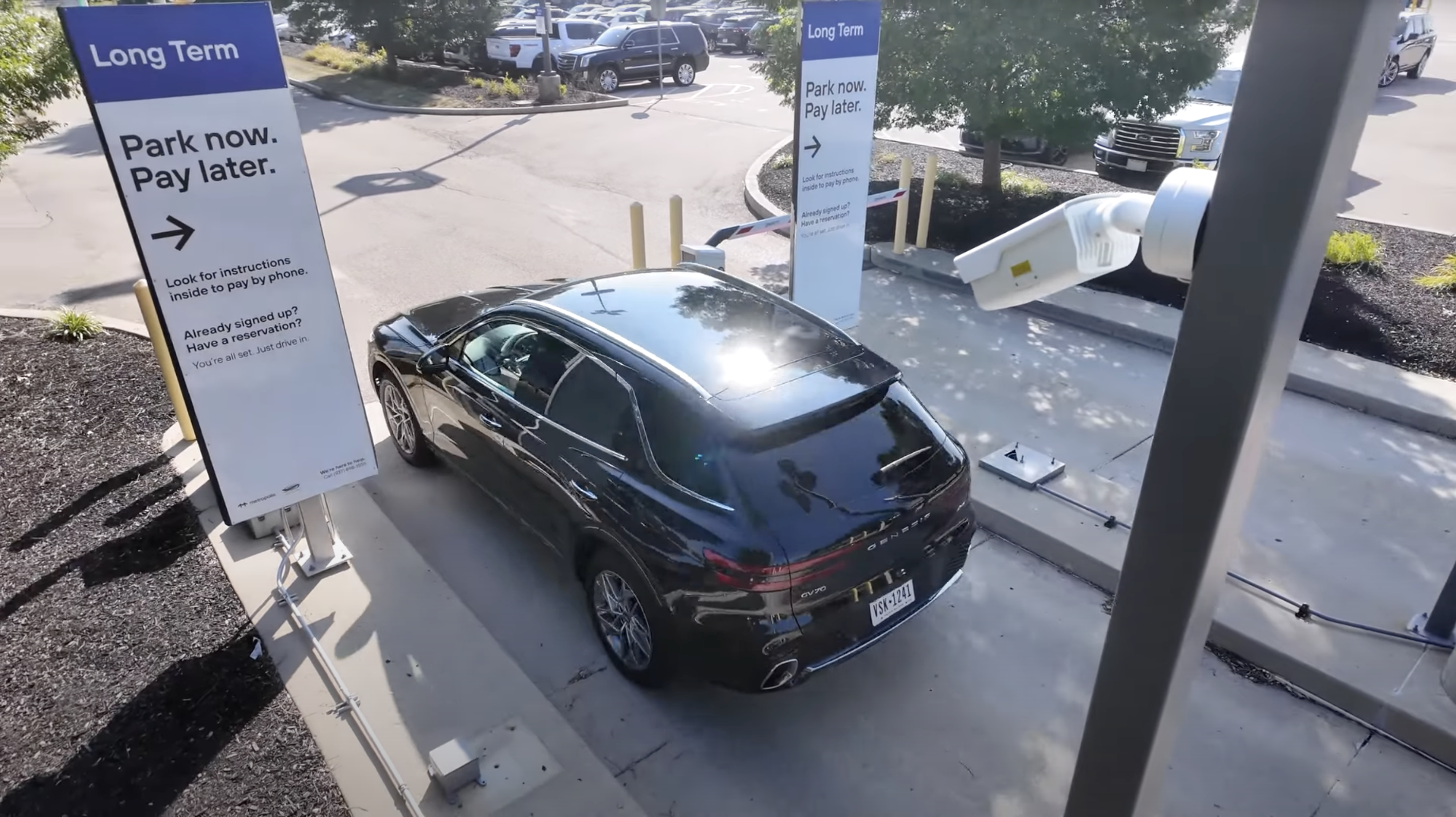
The problem – disconnected physical and digital touch points
For first time users, the first interaction with Metropolis doesn't happen with a digital touchpoint, it happens in the physical environment which then leads to our digital product.
If a user fails to onboard via our signage, they experience friction at the exit and have to text-to-pay while waiting at the exit and Metropolis doesn't convert these drivers into becoming Metropolis members.
Without proper physical touch points, users may never reach the digital touch points and Metropolis misses an opportunity to scale its user base.
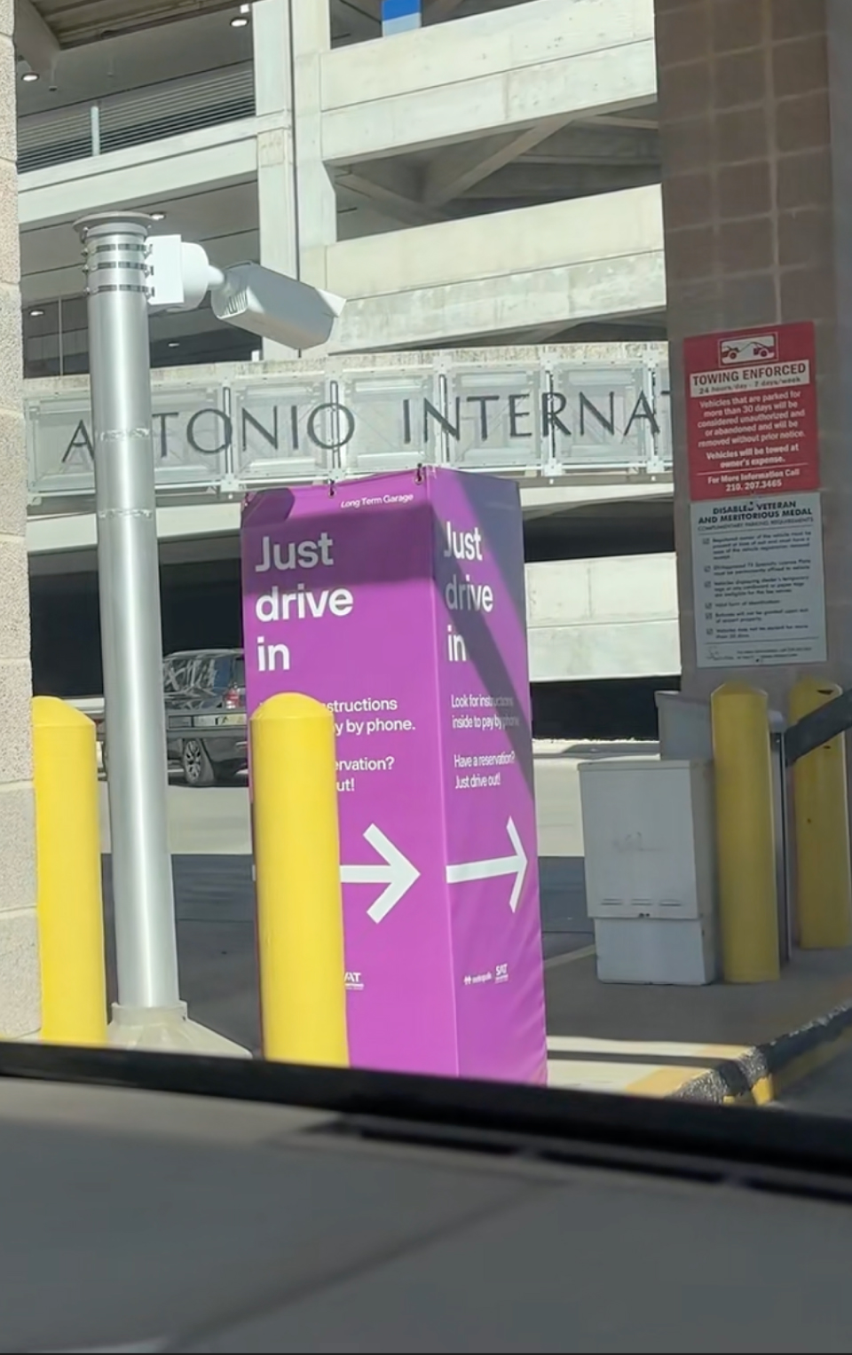
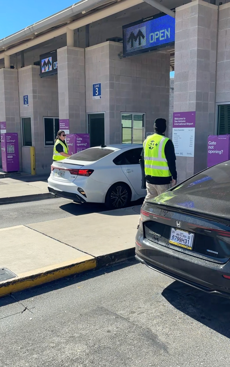
Signage issues brought to life at San Antonio Airport
Metropolis’s first launch in the aviation space at San Antonio Airport revealed experience issues worth addressing.
Data revealed experience gaps and issues post-launch: High % of manual gate vends at exit and lower than average first-time user conversion. Stakeholders involved in the launch mentioned users were having difficulty with our signage package at San Antonio.
With 11 million annual passengers and 9,700 spaces, parking accounts for about 60% of revenue. I went to San Antonio a few weeks post-launch to assess what’s wrong. It came down to three key themes.
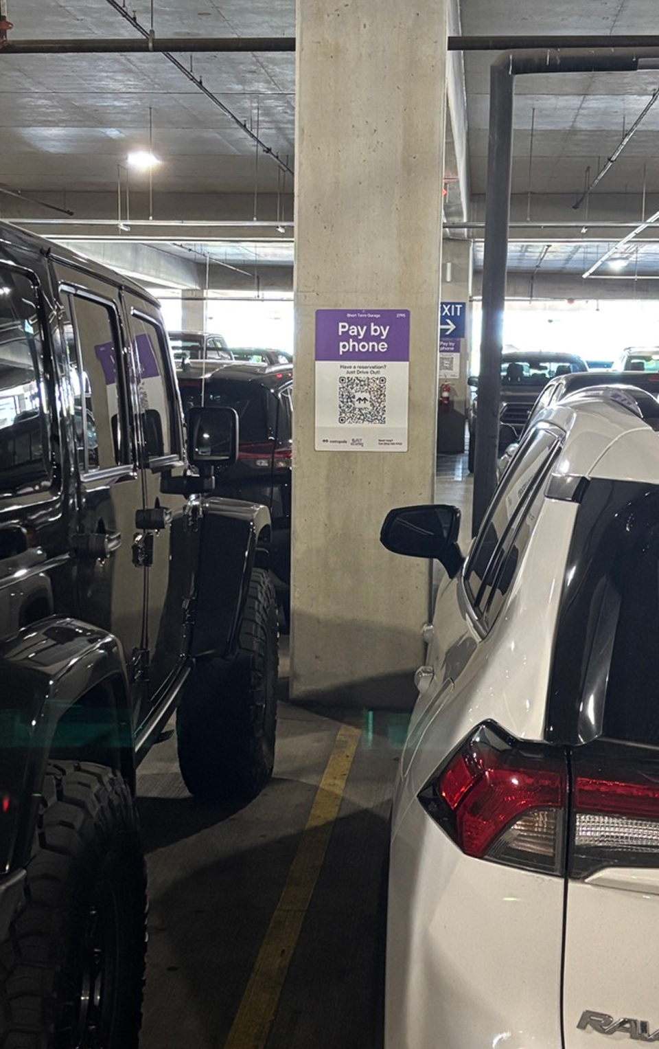
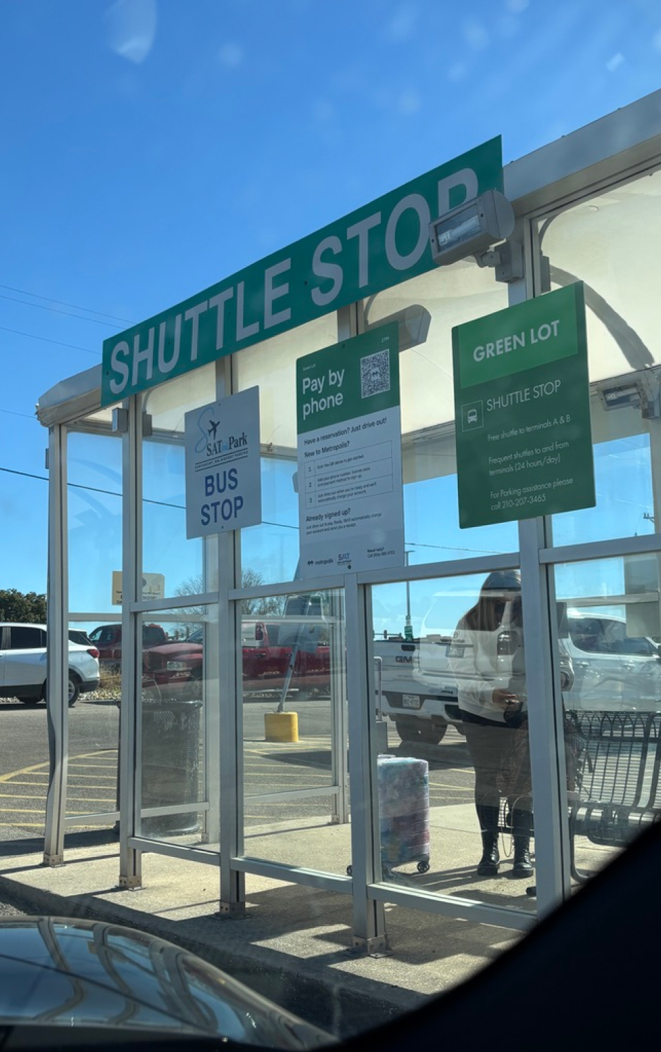
Placement
Hidden sight lines due to large SUVs.
Messaging
“Pay by phone” messaging doesn’t imply paying for parking.
Messaging
Prominent “Just drive in” implies free parking and/or no action needed until exit.
Placement
Signs blend in with other stimuli.
Placement
Poor placement causing congestion/backing up at exit.
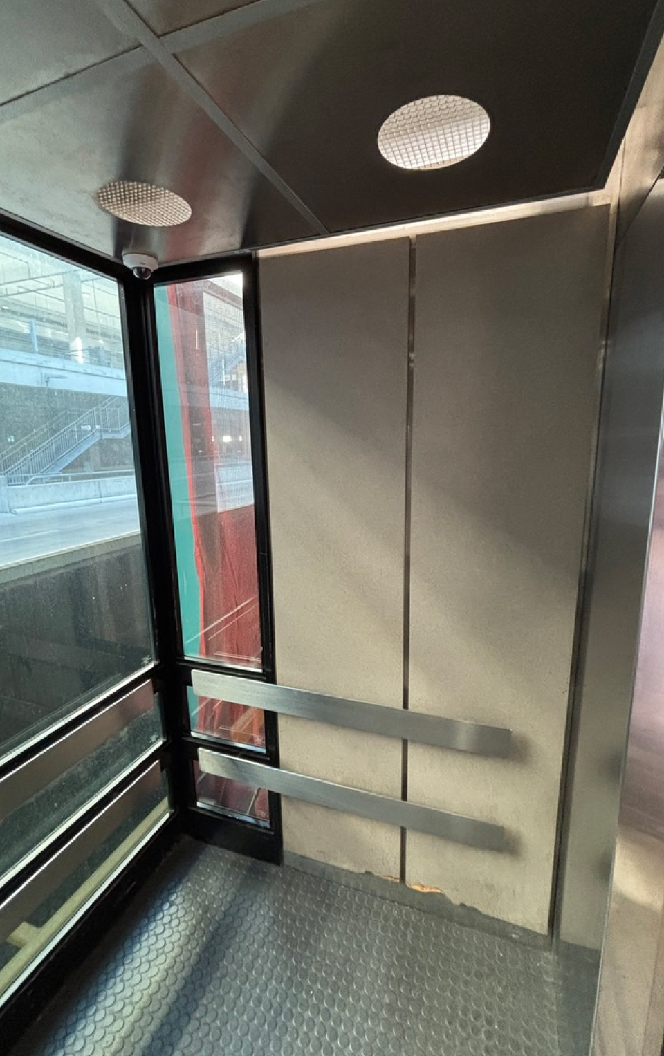
Quantity
Add additional signs to moments of passive time, like in the garage elevator and shuttle.
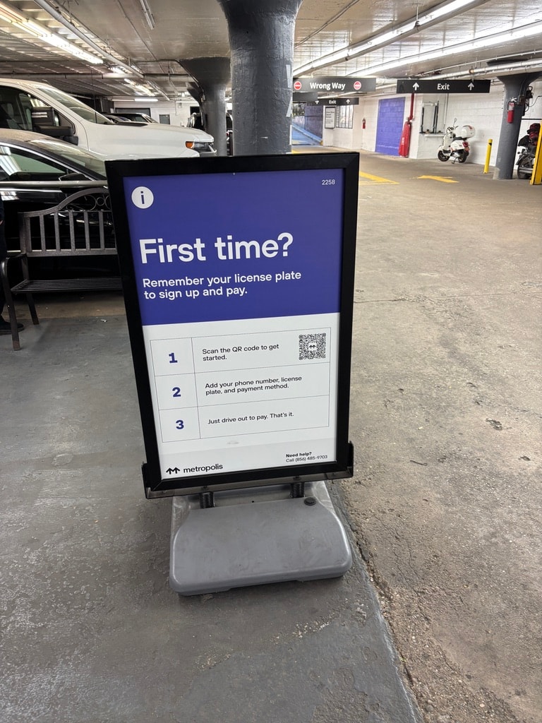
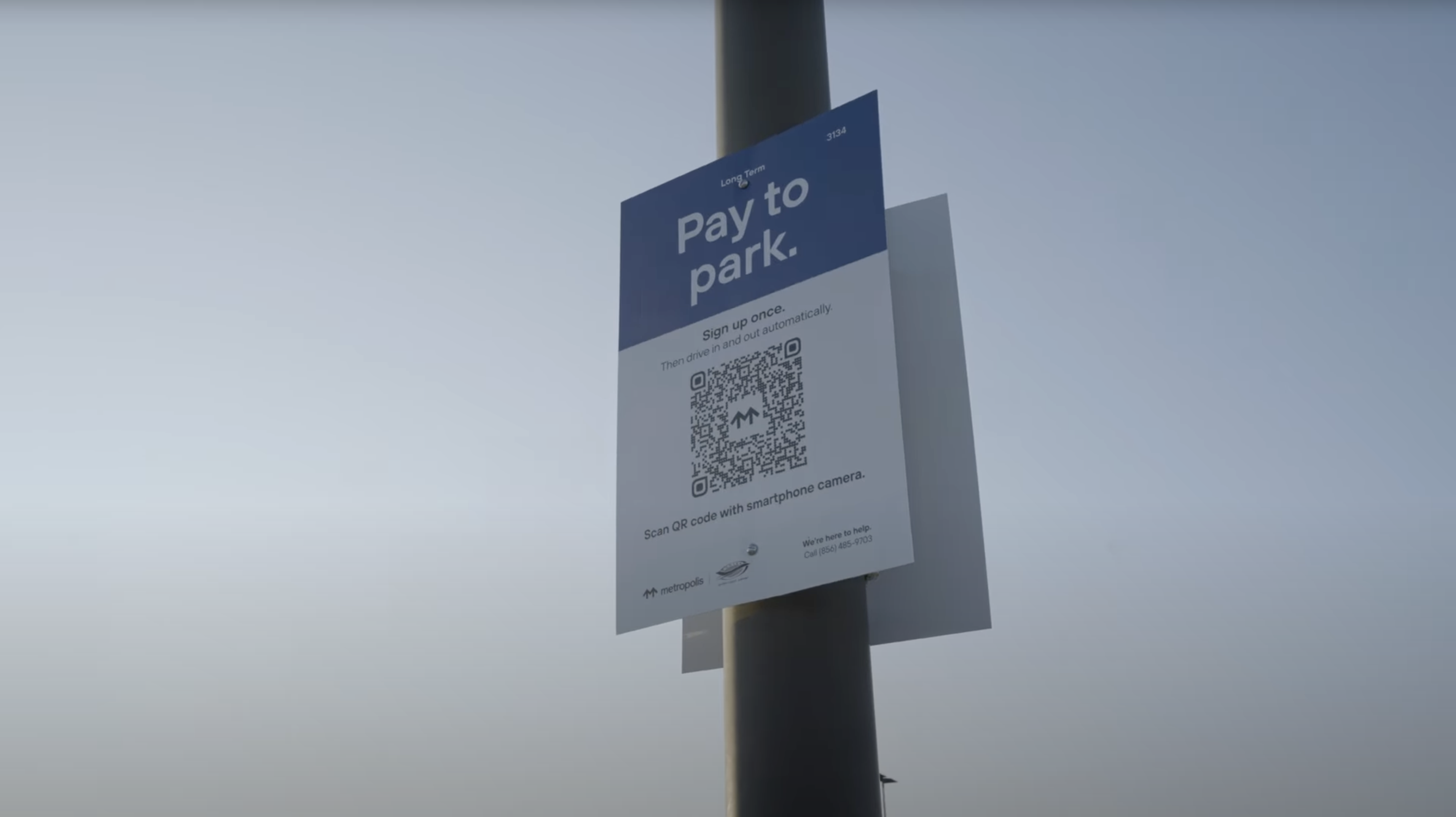
The Metropolis signage problem
Messaging
Signage messaging was inconsistent and unclear. Copy like “First time?” “Pay by phone” and “Just drive in” created confusion, especially when surrounded by other visual noise at the site. Instead of prompting action, the messaging often misled users or failed to signal that any action was required.
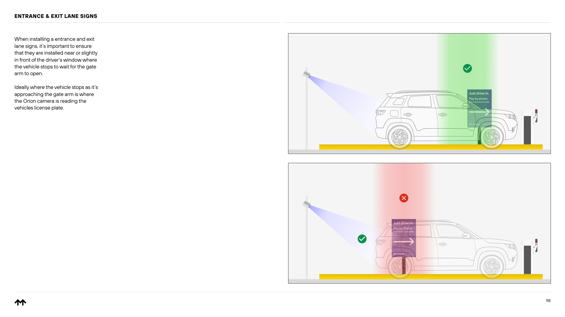
Placement
Even the best message fails if it’s not seen. Many signs were placed outside natural sight lines (e.g. too low for drivers or blocked by vehicles) and missed opportunities in key high foot traffic areas or areas with passive time. In some cases, the right message appeared at the wrong moment in the user journey, reducing its impact.
Quantity
There aren’t always enough signs to create a continuous, guided experience. Users might see a message at entry but lose direction once they moved through the lot or toward their destination. Signage should extend beyond the parking zone, following how people actually move through the space.
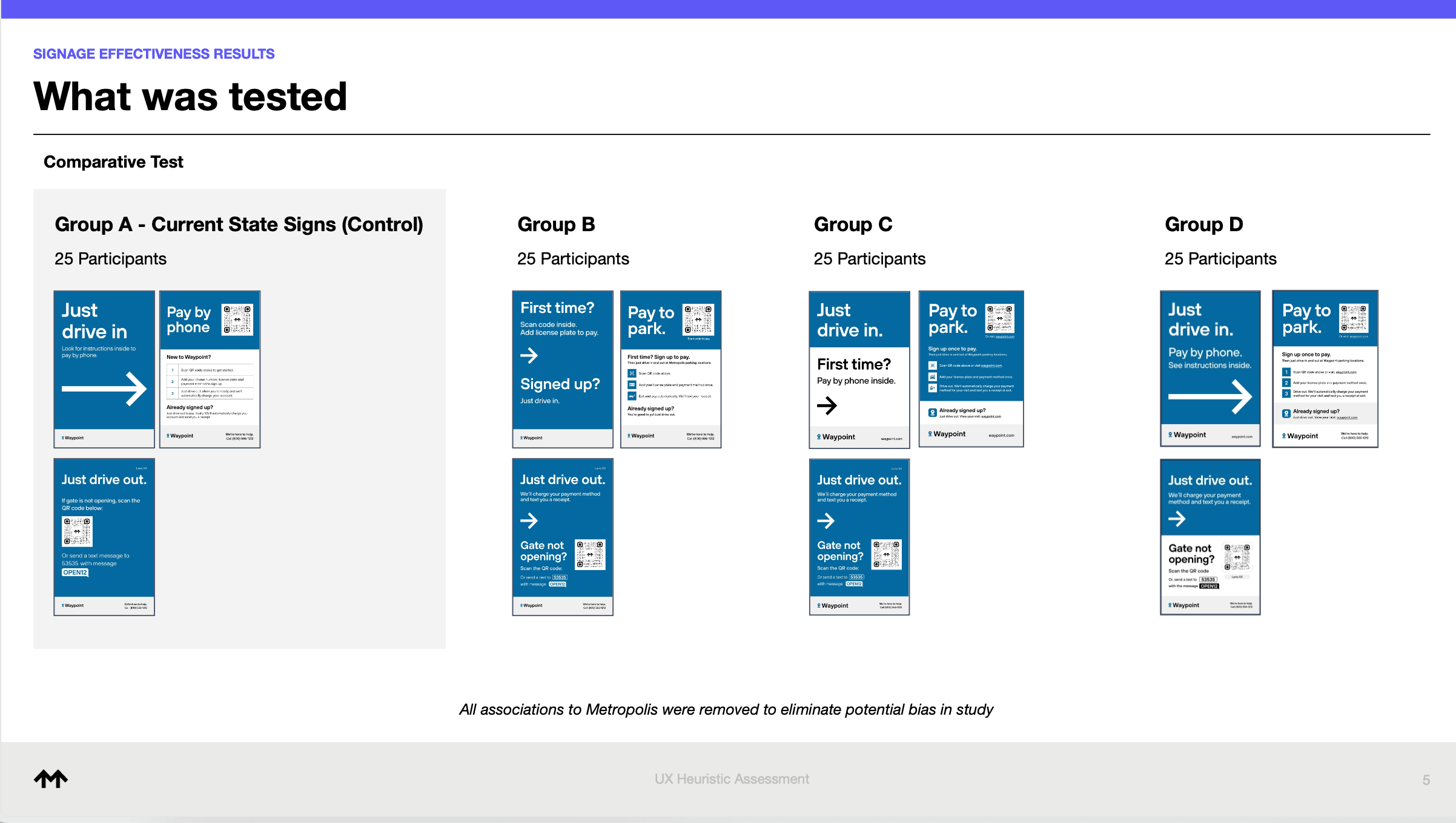
Testing new signage messaging
Partnering with our copywriters, I ran multiple unmoderated A/B tests with participants comparing new messaging against current signage messaging at key moments (entry, exit, and sign-up).
The research goal: identify the most intuitive messaging that helps new users successfully onboard into our product.
I learned through multiple rounds that not every message belongs on a sign. And finding the right balance between what’s communicated physically and what’s reinforced digitally made for a clearer user journey. It’s about messaging at the right time.

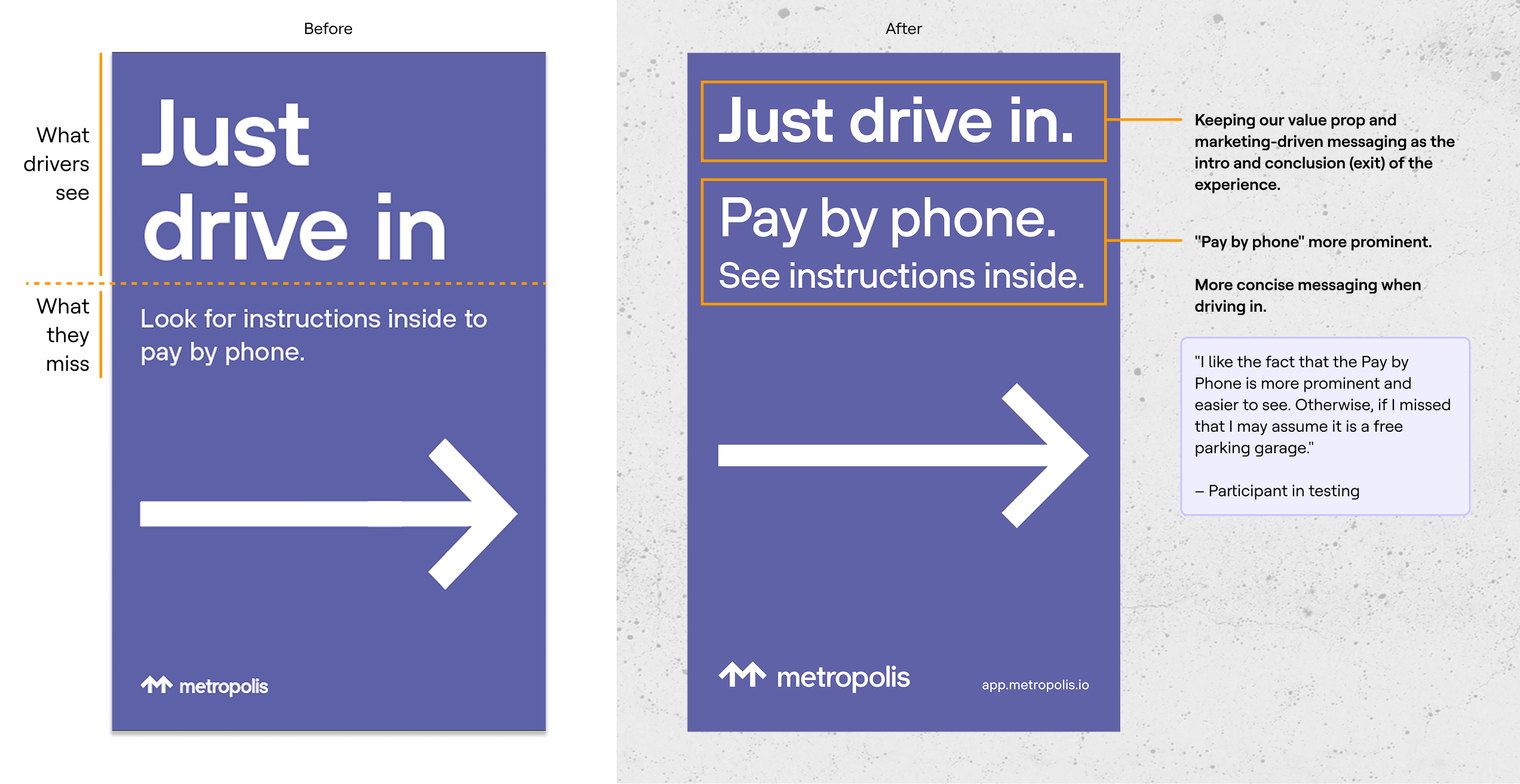
The result – Entrance
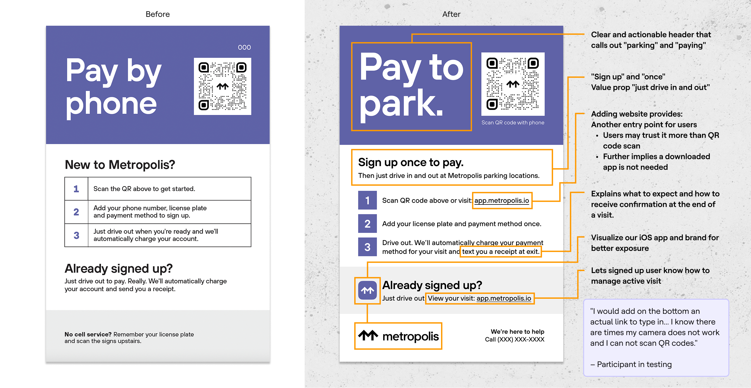
The result – Sign Up
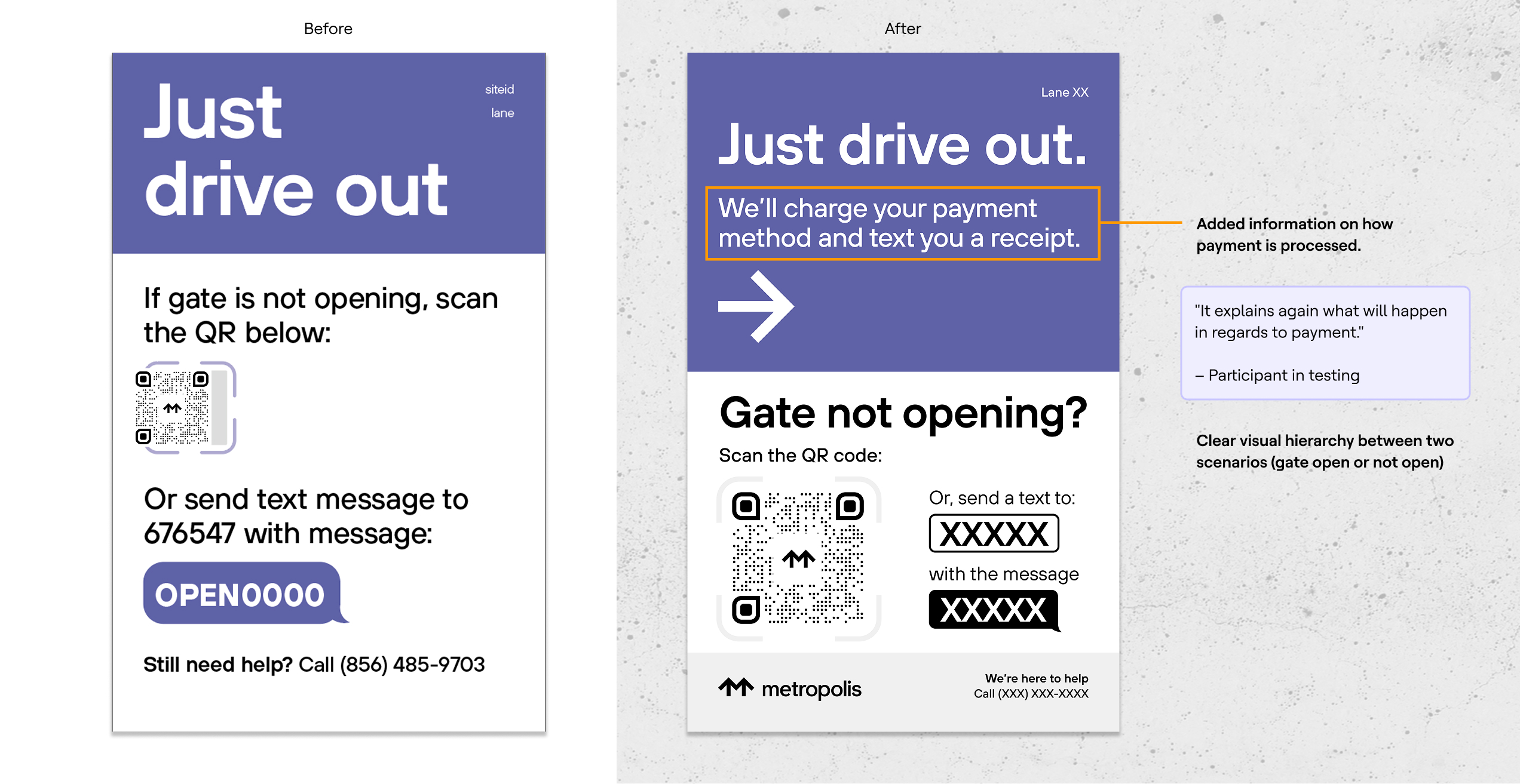
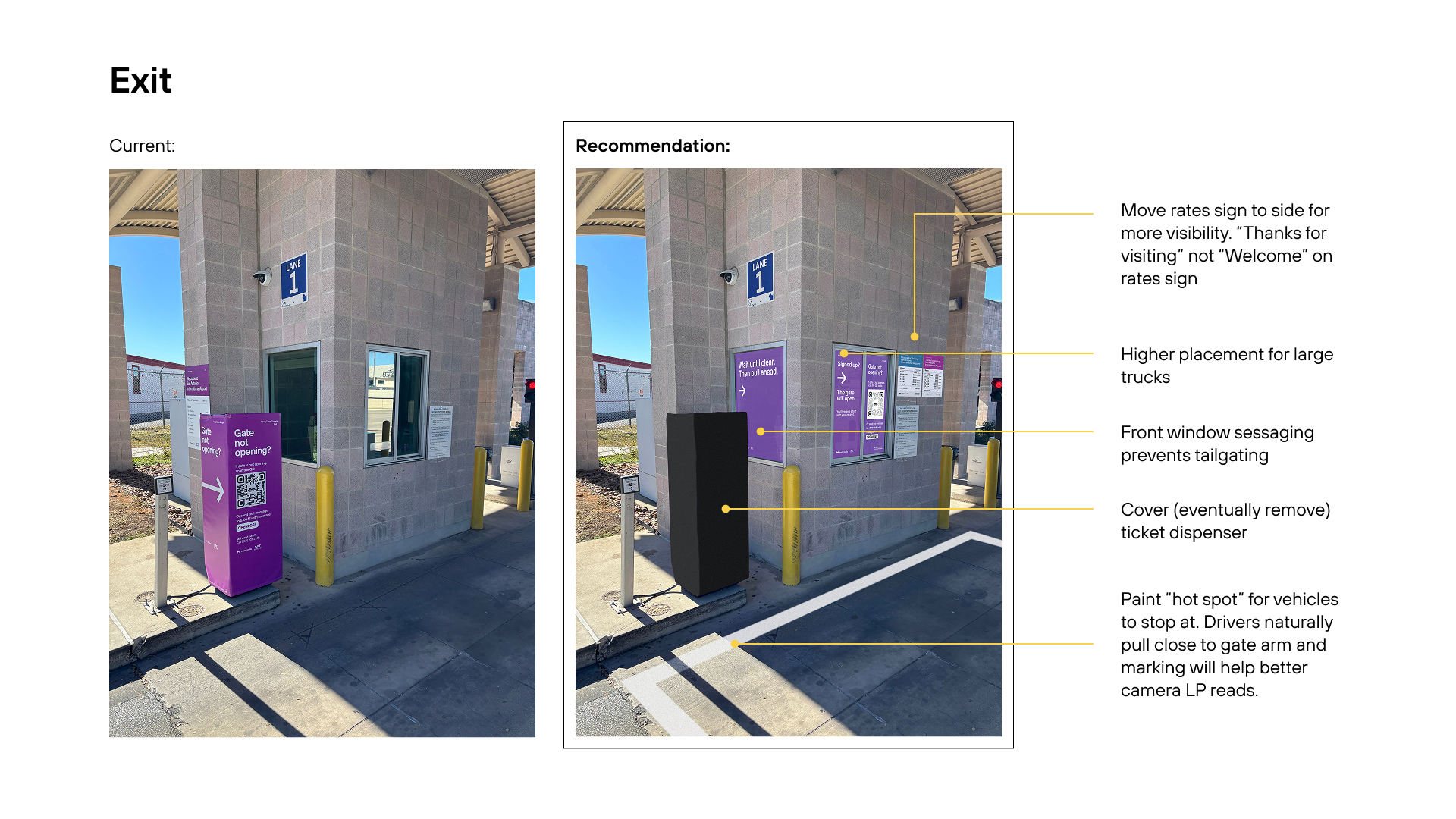
The result – Exit
Sharing findings and recommendations to San Antonio stakeholders
I shared an updated package with San Antonio stakeholders for review and approval.

San Antonio Airport result
Average first-time visit registration increased 4.2% at SAT since new signage package was deployed.
– Ed Krafcik, VP of Aviation
Dayton International Airport, our second aviation site, launched shortly after with these updated signs.
Bridging the physical and digital – signage insights informing onboarding work streams
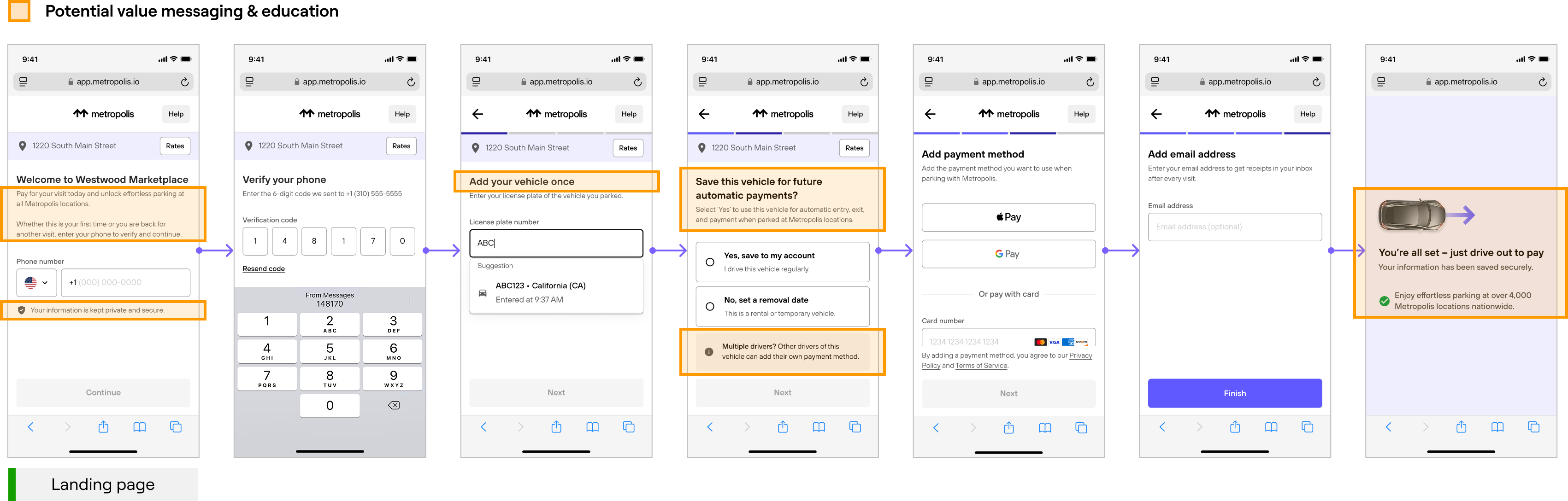
Insights from the signage study revealed that some of the messaging or information users were seeking from signage can be addressed in our digital onboarding flow – another work stream. I partnered with the other product designer and shared my learnings around instructional and value messaging. This is all for the bigger goal of ensuring we're introducing the right information at the right time in the greater user journey.
Onboarding Recommendation 1
Create clarity around allowing multiple drivers for one vehicle.
Onboarding Recommendation 2
Provide email as an option to get receipts.
Onboarding Recommendation 3
Provide more clarity and trust around Metropolis technology and the long term value our product provides.
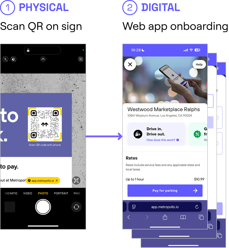
Partnering to improve onboarding conversion & effectiveness
Data revealed a significant drop-off after the landing page in our onboarding flow.
To better understand user perception, I partnered with the product designer on the Visit Experience team to run a survey using the new signage entry point and current onboarding flow. Results showed that 38% of participants believed they’d need to onboard every time they parked, highlighting that our messaging was still unclear.
Heap metrics of our onboarding show a severe drop-off after the landing page.

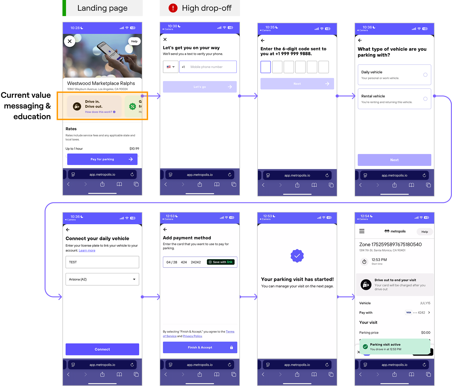
Onboarding
Working with marketing, product, and design, several work streams were added to the product roadmap to address onboarding improvements based on my signage testing insights. We’re exploring ways to consolidate the landing page to combine value messaging and the first input field. email address opt-in, and where value and information messaging resonates with users the most in the flow
All efforts have the the goal of improving conversion and getting more users to sign up and educating the new user on the product and the value it provides.

Metropolis Signage & Onboarding
The goal
Create a clearer, more consistent signage system that statistically improves first-time user registration, reduces friction at entry, and strengthens the bridge between the physical and digital touch points.
My role
Design lead
Duration
9 months
Team
1 Project Manager
1 Product Designer
2 Copywriters
1 Director of Ops
Context

Metropolis averages 40-55,000 first-time users every day.
On average, 13.4% of these users don’t sign up (non-compliant) on payable parking visits.

Signage at our 4,500+ parking locations is the key entry point into onboarding and signing up.
The problem – disconnected physical and digital touch points
For first time users, the first interaction with Metropolis doesn't happen with a digital touchpoint, it happens in the physical environment which then leads to our digital product.
If a user fails to onboard via our signage, they experience friction at the exit and have to text-to-pay while waiting at the exit and Metropolis doesn't convert these drivers into becoming Metropolis members.
Without proper physical touch points, users may never reach the digital touch points and Metropolis misses an opportunity to scale its user base.
Signage issues brought to life at San Antonio Airport
Metropolis’s first launch in the aviation space at San Antonio Airport revealed experience issues worth addressing.
Data revealed experience gaps and issues post-launch: High % of manual gate vends at exit and lower than average first-time user conversion. Stakeholders involved in the launch mentioned users were having difficulty with our signage package at San Antonio.
With 11 million annual passengers and 9,700 spaces, parking accounts for about 60% of revenue. I went to San Antonio a few weeks post-launch to assess what’s wrong. It came down to three key themes.
Placement
Hidden sight lines due to large SUVs.
Messaging
“Pay by phone” messaging doesn’t imply paying for parking.
Messaging
Prominent “Just drive in” implies free parking and/or no action needed until exit.
Placement
Signs blend in with other stimuli.
Placement
Poor placement causing congestion/backing up at exit.
Quantity
Add additional signs to moments of passive time, like in the garage elevator and shuttle.
The Metropolis signage problem
Messaging
Signage messaging was inconsistent and unclear. Copy like “First time?” “Pay by phone” and “Just drive in” created confusion, especially when surrounded by other visual noise at the site. Instead of prompting action, the messaging often misled users or failed to signal that any action was required.
Placement
Even the best message fails if it’s not seen. Many signs were placed outside natural sight lines (e.g. too low for drivers or blocked by vehicles) and missed opportunities in key high foot traffic areas or areas with passive time. In some cases, the right message appeared at the wrong moment in the user journey, reducing its impact.
Quantity
There aren’t always enough signs to create a continuous, guided experience. Users might see a message at entry but lose direction once they moved through the lot or toward their destination. Signage should extend beyond the parking zone, following how people actually move through the space.
Testing new signage messaging
Partnering with our copywriters, I ran multiple unmoderated A/B tests with participants comparing new messaging against current signage messaging at key moments (entry, exit, and sign-up).
The research goal: identify the most intuitive messaging that helps new users successfully onboard into our product.
I learned through multiple rounds that not every message belongs on a sign. And finding the right balance between what’s communicated physically and what’s reinforced digitally made for a clearer user journey. It’s about messaging at the right time.
The result – Entrance
The result – Sign Up
The result – Exit
Sharing findings and recommendations to San Antonio stakeholders
I shared an updated package with San Antonio stakeholders for review and approval.
San Antonio Airport result
Average first-time visit registration increased 4.2% at SAT since new signage package was deployed.
– Ed Krafcik, VP of Aviation
Dayton International Airport, our second aviation site, launched shortly after with these updated signs.
Bridging the physical and digital – signage insights informing onboarding work streams
Insights from the signage study revealed that some of the messaging or information users were seeking from signage can be addressed in our digital onboarding flow – another work stream. I partnered with the other product designer and shared my learnings around instructional and value messaging. This is all for the bigger goal of ensuring we're introducing the right information at the right time in the greater user journey.
Onboarding Recommendation 1
Create clarity around allowing multiple drivers for one vehicle.
Onboarding Recommendation 2
Provide email as an option to get receipts.
Onboarding Recommendation 3
Provide more clarity and trust around Metropolis technology and the long term value our product provides.
Partnering to improve onboarding conversion & effectiveness
Data revealed a significant drop-off after the landing page in our onboarding flow.
To better understand user perception, I partnered with the product designer on the Visit Experience team to run a survey using the new signage entry point and current onboarding flow. Results showed that 38% of participants believed they’d need to onboard every time they parked, highlighting that our messaging was still unclear.
Heap metrics of our onboarding show a severe drop-off after the landing page.
Onboarding
Working with marketing, product, and design, several work streams were added to the product roadmap to address onboarding improvements based on my signage testing insights. We’re exploring ways to consolidate the landing page to combine value messaging and the first input field. email address opt-in, and where value and information messaging resonates with users the most in the flow
All efforts have the the goal of improving conversion and getting more users to sign up and educating the new user on the product and the value it provides.

Metropolis Signage & Onboarding
The goal
Create a clearer, more consistent signage system that statistically improves first-time user registration, reduces friction at entry, and strengthens the bridge between the physical and digital touch points.
My role
Design lead
Duration
9 months
Team
1 Project Manager
1 Product Designer
2 Copywriters
1 Director of Ops
Context

Metropolis averages 40-55,000 first-time users every day.
On average, 13.4% of these users don’t sign up (non-compliant) on payable parking visits.
Signage at our 4,500+ parking locations is the key entry point into onboarding and signing up.
The problem – disconnected physical and digital touch points
For first time users, the first interaction with Metropolis doesn't happen with a digital touchpoint, it happens in the physical environment which then leads to our digital product.
If a user fails to onboard via our signage, they experience friction at the exit and have to text-to-pay while waiting at the exit and Metropolis doesn't convert these drivers into becoming Metropolis members.
Without proper physical touch points, users may never reach the digital touch points and Metropolis misses an opportunity to scale its user base.
Signage issues brought to life at San Antonio Airport
Metropolis’s first launch in the aviation space at San Antonio Airport revealed experience issues worth addressing.
Data revealed experience gaps and issues post-launch: High % of manual gate vends at exit and lower than average first-time user conversion. Stakeholders involved in the launch mentioned users were having difficulty with our signage package at San Antonio.
With 11 million annual passengers and 9,700 spaces, parking accounts for about 60% of revenue. I went to San Antonio a few weeks post-launch to assess what’s wrong. It came down to three key themes.
Placement
Hidden sight lines due to large SUVs.
Messaging
“Pay by phone” messaging doesn’t imply paying for parking.
Messaging
Prominent “Just drive in” implies free parking and/or no action needed until exit.
Placement
Signs blend in with other stimuli.
Placement
Poor placement causing congestion/backing up at exit.
Quantity
Add additional signs to moments of passive time, like in the garage elevator and shuttle.
The Metropolis signage problem
Messaging
Signage messaging was inconsistent and unclear. Copy like “First time?” “Pay by phone” and “Just drive in” created confusion, especially when surrounded by other visual noise at the site. Instead of prompting action, the messaging often misled users or failed to signal that any action was required.
Placement
Even the best message fails if it’s not seen. Many signs were placed outside natural sight lines (e.g. too low for drivers or blocked by vehicles) and missed opportunities in key high foot traffic areas or areas with passive time. In some cases, the right message appeared at the wrong moment in the user journey, reducing its impact.
Quantity
There aren’t always enough signs to create a continuous, guided experience. Users might see a message at entry but lose direction once they moved through the lot or toward their destination. Signage should extend beyond the parking zone, following how people actually move through the space.
Testing new signage messaging
Partnering with our copywriters, I ran multiple unmoderated A/B tests with participants comparing new messaging against current signage messaging at key moments (entry, exit, and sign-up).
The research goal: identify the most intuitive messaging that helps new users successfully onboard into our product.
I learned through multiple rounds that not every message belongs on a sign. And finding the right balance between what’s communicated physically and what’s reinforced digitally made for a clearer user journey. It’s about messaging at the right time.
The result – Entrance
The result – Sign Up
The result – Exit
Sharing findings and recommendations to San Antonio stakeholders
I shared an updated package with San Antonio stakeholders for review and approval.
San Antonio Airport result
Average first-time visit registration increased 4.2% at SAT since new signage package was deployed.
– Ed Krafcik, VP of Aviation
Dayton International Airport, our second aviation site, launched shortly after with these updated signs.
Bridging the physical and digital – signage insights informing onboarding work streams
Insights from the signage study revealed that some of the messaging or information users were seeking from signage can be addressed in our digital onboarding flow – another work stream. I partnered with the other product designer and shared my learnings around instructional and value messaging. This is all for the bigger goal of ensuring we're introducing the right information at the right time in the greater user journey.
Onboarding Recommendation 1
Create clarity around allowing multiple drivers for one vehicle.
Onboarding Recommendation 2
Provide email as an option to get receipts.
Onboarding Recommendation 3
Provide more clarity and trust around Metropolis technology and the long term value our product provides.
Partnering to improve onboarding conversion & effectiveness
Data revealed a significant drop-off after the landing page in our onboarding flow.
To better understand user perception, I partnered with the product designer on the Visit Experience team to run a survey using the new signage entry point and current onboarding flow. Results showed that 38% of participants believed they’d need to onboard every time they parked, highlighting that our messaging was still unclear.
Heap metrics of our onboarding show a severe drop-off after the landing page.
Onboarding
Working with marketing, product, and design, several work streams were added to the product roadmap to address onboarding improvements based on my signage testing insights. We’re exploring ways to consolidate the landing page to combine value messaging and the first input field. email address opt-in, and where value and information messaging resonates with users the most in the flow
All efforts have the the goal of improving conversion and getting more users to sign up and educating the new user on the product and the value it provides.